Planning to redecorate your house sometime soon? Before you start buying new pieces and moving furniture around, take some time to learn these common interior design terms. The right words give you a better way to plan a room that looks pulled together. You don’t need to speak like a designer at a consultation. You just need enough language to understand why one sofa overwhelms a room while another one fits without a fight.
Scale
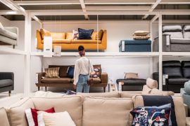
Scale is a very important thing to consider when selecting furniture. It’s the relationship that shows whether a piece matches the size of your room and the other items inside it. Too large, and the room starts to look cramped. Too small, and the piece seems lost. Wondering where to start? Look at your largest item first, since everything else has to share space with it.
Proportion
Proportion is about how one part of a room relates to another. A chair with a tall back and thin legs may look awkward because the visual weight sits too high. The same idea applies across a room. If a narrow coffee table sits in front of a deep sofa, the table may look too slight for the seating area even if it technically fits the floor plan. When you understand proportion, you can choose pieces that look like they belong together.
Focal Point
A focal point is the first feature people notice when they enter a room. In a living room, that may be the fireplace. In a bedroom, it may be the bed. Once you know what people will notice first, the rest of the room has something to work around. Without a focal point, the layout can seem scattered because every part of the room is trying to pull attention.
Flow
Flow describes how people move through a room. If you have to squeeze between the sofa and table every time you cross the space, the room is working against you. Not ideal. Good flow gives you enough walking space without making the room look empty. Before you buy something new, picture how you’ll move through the room. That saves you from a layout that looks nice but lives poorly.
Contrast
Contrast adds visual interest by placing different elements near each other. A dark table against a light rug gives your eye something to notice. Without contrast, a room may look flat because every surface blends together. The trick is restraint. You don’t need a dramatic makeover to use contrast well. One stronger difference in color or material can give the room more depth without making it look busy.
Redecorating Gets Easier When You Know the Language
You don’t need a design degree to make smarter choices at home. Once you understand scale, proportion, focal point, flow, and contrast, you can spot why a room looks crowded or unfinished. Keep these interior design terms in mind before you redecorate, and your choices will start to connect instead of competing for attention.